
2024 Color Palettes with Sustainability in Mind
Discover how design in 2024 embraces sustainability not just in materials and processes, but also through thoughtfully curated color palettes. This page explores how color trends are being shaped by ecological consciousness, environmental awareness, and a demand for longevity in both aesthetics and resources. Learn how impactful color selection can express a brand’s values and commitment to a greener future, while also resonating with the expectations of modern audiences.
The Rise of Eco-Conscious Colors
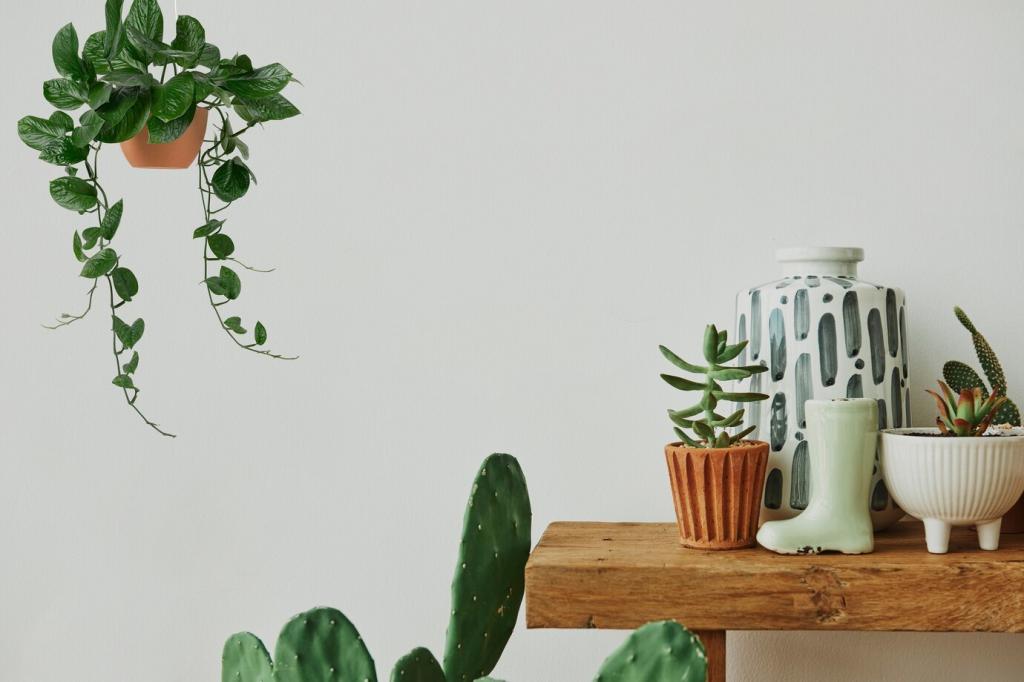
Earthy colors such as clay reds, mossy greens, and warm beiges evoke a sense of grounding and connection to the planet. These shades are rooted in the landscapes many seek to protect, referencing forests, soil, and untouched wilderness. Organic tones speak to the beauty of imperfection and the power of authenticity. By choosing palettes inspired by the natural world, designers reflect a dedication to living more simply and responsibly. These colors are visually calming, promote wellness, and serve as a daily reminder of our ecosystems, our origins, and our obligation to preserve these environments.

2024 Palette Inspirations from Nature
Forest Canopies and Woodland Shades
Deep greens, muted browns, and soft lichen greys echo the rich variety of the world’s forests. These palettes reflect the shelter, tranquility, and resilience found in old-growth woodlands. Incorporating them into designs helps brands signal longevity, stability, and respect for nature. Woodland shades are especially relevant for products and services connected with wellness, outdoor living, or conservation. They invite a sense of serenity while underscoring the urgent need to protect the forests that inspire them.
Ocean-Inspired Blues and Coastal Neutrals
Aquatic hues from the world’s oceans and coastlines are capturing the imagination of designers keen to promote marine conservation. Blues ranging from the deepest navy to airy turquoise suggest depth, clarity, and purity. Coastal neutrals, inspired by sand, driftwood, and shells, offer a calming contrast. This marine-inspired palette celebrates the vastness and fragility of aquatic ecosystems. It’s an invitation to defend these environments and to embrace the peace and clarity that water brings both visually and metaphorically.
Desert and Mountain Landscape Tones
The subtle magic of deserts and highlands comes alive in palettes featuring warm ochres, soft terracottas, sun-baked yellows, and cool basalt greys. These colors highlight the raw beauty found in arid and alpine environments—places especially vulnerable to climate change. By using these hues, designers draw attention to the splendor and precarity of remote, less-explored ecosystems. They remind us that sustainability must be holistic, protecting not just lush forests and oceans, but also the resilience and wonders of the world’s more austere terrains.